You’ve probably seen Ed Hawkins’ Climate Stripes. Those bands of blue-to-red show how global temperatures have shifted over time. Hawkins created them at the University of Reading, where I did my undergrad and where I’m doing my MSc now. I’ve been aware of them for years.
I came at this from a climate science background with no prior web development experience. But at some point the question stuck: wouldn’t it be useful if you could see climate stripes for your city? Not national or global averages, but the actual temperature history of individual cities, with seasonal breakdowns and different baselines.
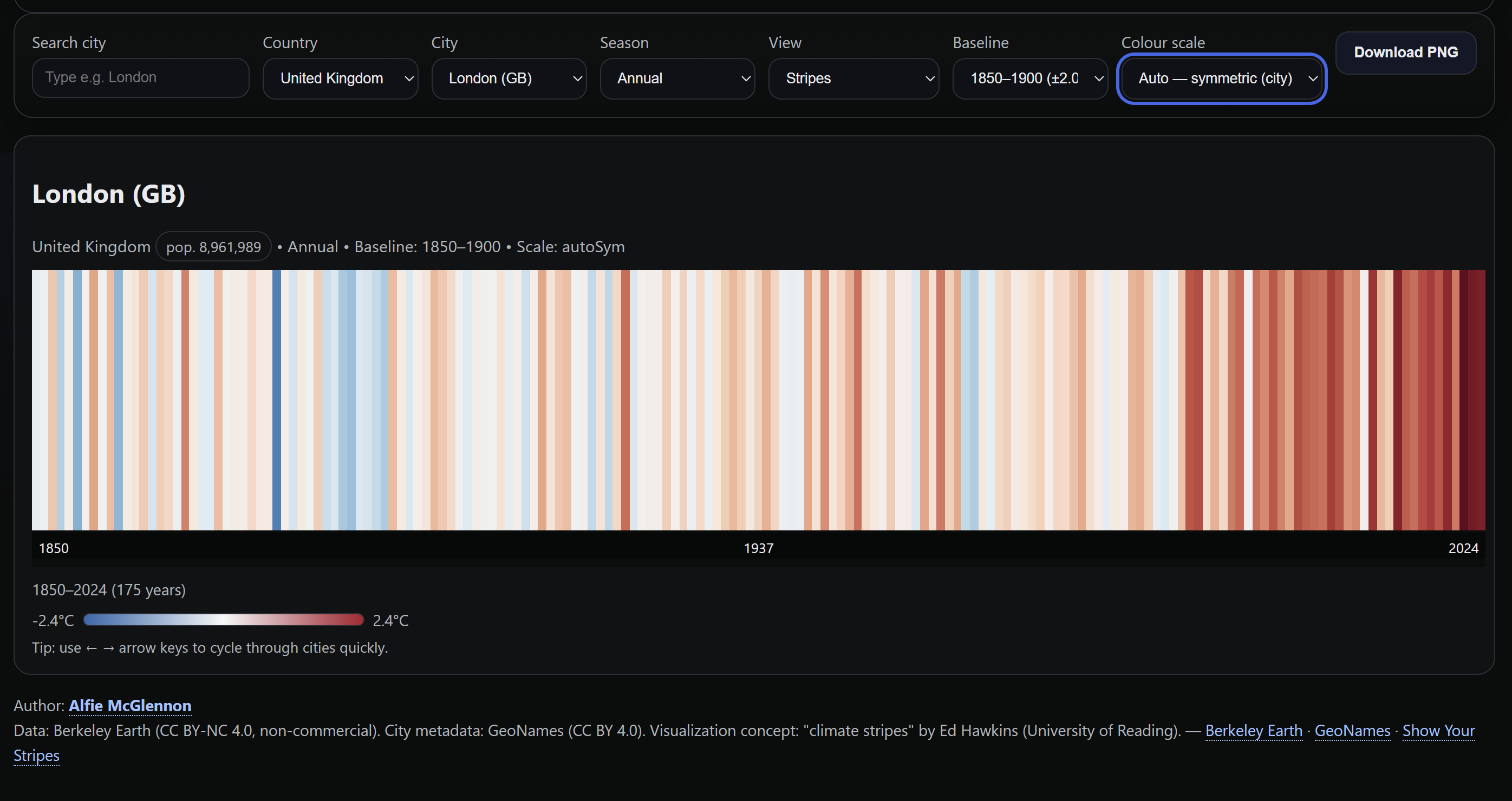
So I built it. City Climate Bars & Stripes is an interactive tool that lets you explore temperature anomalies for over 6,000 cities worldwide, from 1850 to present.
What it does
Pick a city and get a visualisation of its temperature history:
- Annual and seasonal views. Full year, or drill into winter (DJF), spring (MAM), summer (JJA), or autumn (SON). Seasonal patterns can be dramatically different from annual averages.
- Bars and stripes modes. Bars give you a proper axis with a zero line for exact anomaly values; stripes give the clean Hawkins-style view.
- Two baseline periods. 1850 to 1900 (pre-industrial) or 1961 to 2010 (modern climatological normal). Switching between these changes the story the data tells.
- Three colour scaling modes. Fixed scale (consistent across all cities), auto-symmetric (scaled to each city’s data), or auto min-max.
- Quick browsing. Arrow keys let you flip through cities rapidly.
- PNG download. Grab and share any view with one click.
The tech
The entire application is a single index.html file. No build tools, no frameworks, no backend. Everything runs client-side.
- HTML5 Canvas for rendering (handles the data volume better than SVG and makes PNG export trivial)
- D3.js for CSV parsing and the red-blue diverging colour scale (
d3.interpolateRdBu) - Vanilla JavaScript for state management, DOM updates, keyboard navigation
- CSS Grid for responsive layout
The data comes from Berkeley Earth (temperature anomalies, CC BY-NC 4.0) and GeoNames (city metadata, CC BY 4.0). About 230MB of CSV data covering ~6,100 cities, split across multiple files so the browser can load them in parallel.
Data pipeline
CSV files are fetched in parallel with timeout handling. D3 parses them with a flexible row parser that handles column name variations across the seasonal and annual datasets (they don’t use identical headers). Data is aggregated by city and country code into a lookup map. On city selection, the relevant slice is pulled, sorted by year, and fed into the canvas renderer.
The renderer computes colour domains based on the active scaling mode, maps each year’s anomaly to a position on the blue-red spectrum, and draws either bars or stripes. High-DPI displays get proper device pixel ratio scaling.
Interesting problems
Colour domain logic. Fixed domains need to be wide enough to not clip most cities. Auto-symmetric needs to always include zero and be symmetric around it. Auto min-max needs to span the actual data range while still including zero. Each mode also has a floor so it never collapses to a useless narrow band.
Column name inconsistencies. Rather than preprocessing everything into a uniform format, I wrote a flexible parser that maps multiple naming conventions to the same internal fields. Pragmatic, not elegant.
Performance at scale. 6,000+ cities with 170 years of data across 5 seasonal views adds up. Splitting the CSVs, using canvas instead of SVG, and debouncing renders with requestAnimationFrame keeps it responsive.
What I learned
Climate data is fascinating at the city level. Global averages smooth out so much. Individual cities show wildly different seasonal patterns. Some warming far faster than others, winter trends that look nothing like summer ones. The tool makes this explorable in a way that raw CSV data doesn’t.
Having a clear vision of what the end product should look and feel like mattered more than knowing the framework ecosystem. The domain knowledge (which features are useful, what baselines to offer, why seasonal views tell a different story) drove the design.
This is an exploratory visualisation, not a scientific tool. The Berkeley Earth city data involves interpolation, and the geographic matching isn’t perfect. For rigorous analysis, the official Climate Stripes project is the place to go. But as a way to see and feel how temperatures have changed in cities you know, it does the job.
Data from Berkeley Earth and GeoNames, inspired by Ed Hawkins’ Climate Stripes.